The Rocket: A Visual Engine For Growth
The rocket is one of the most recognizable elements in the Ignite visual system, using simple and bold shapes. It began as a conceptual symbol of leadership development and evolved into flexible, scalable illustrations that anchor the brand across all print and digital platforms.
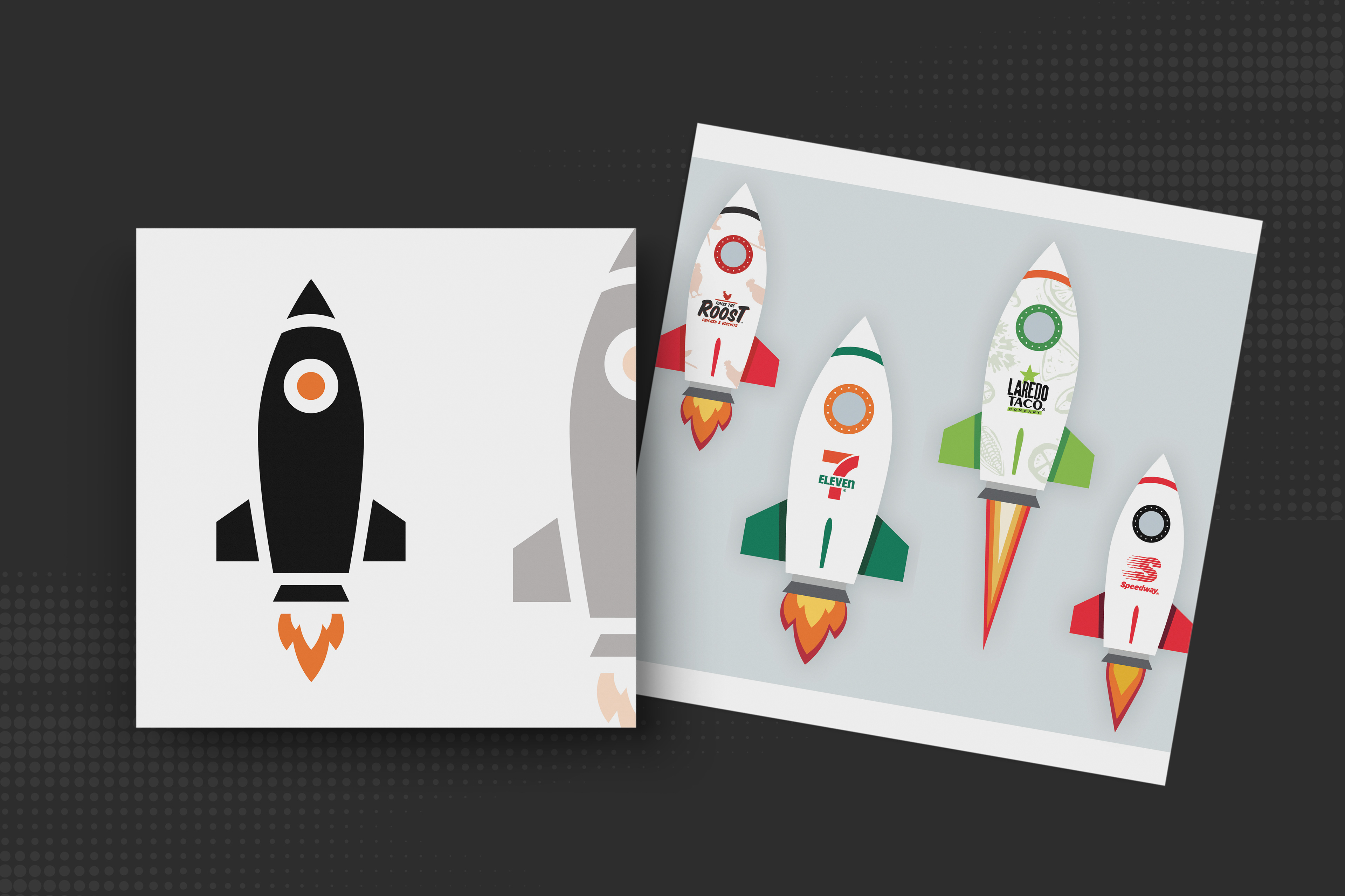
A set of rockets was created to represent our core 7-Eleven banners: 7-Eleven, Speedway, Laredo Taco Company and Roost Chicken & Biscuits. These branded rockets appear more frequently in materials than the version used in the logo and play a central role in how the system comes to life. Each one keeps the same core structure as the logo rocket but incorporates unique brand cues through color and detail. They're used across course materials and storytelling moments specific to each brand.
Each rocket may appear in one of three flight phases, visualizing the progression of the leadership journey. Changes in flame shape, size and color help express movement and advancement, with each phase aligned to a specific course stage.
Together, the rocket illustrations create a strong visual element across all materials, while reinforcing the idea that leadership is a journey with a clear direction forward.

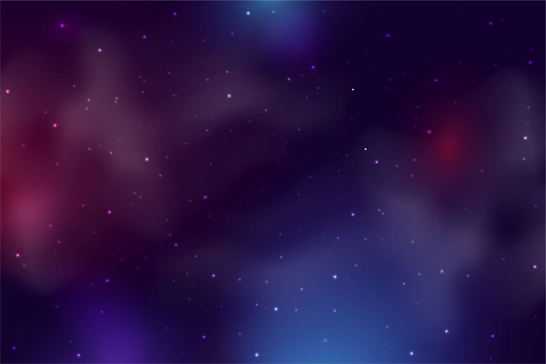
Nebula Patterns: Atmosphere That Supports the Story
To add depth and atmosphere to the system, we developed a series of nebula patterns that support the Ignite story and enhance background compositions. These textures introduce a sense of space, energy and motion, complementing the rocket theme while adding visual interest across print and digital materials.
The nebula artwork was designed to feel expansive but not overpowering. It works best as a layered background element that breaks up solid color fields, adds tonal variety and introduces subtle movement to the composition.
One of the nebula patterns also plays a key role in the Stage 3: Boost Your Leadership Brand course badge, reinforcing the idea of elevation as leaders reach the final phase of their development journey.


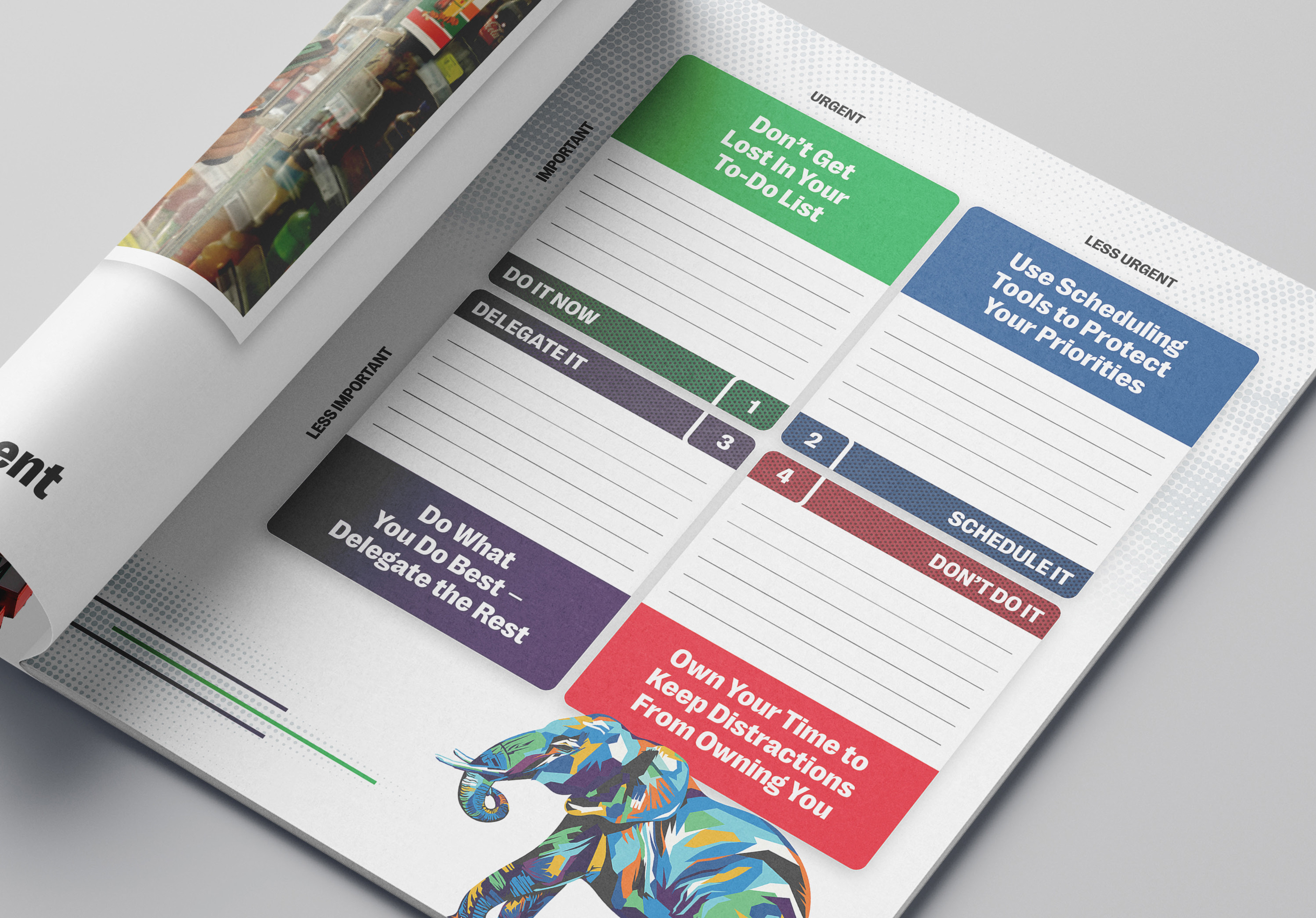
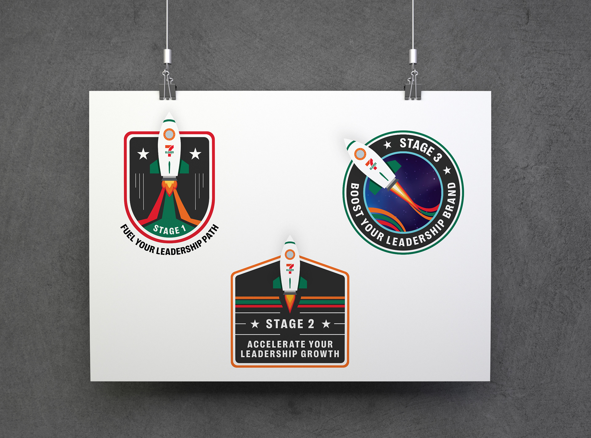
Course Badges
The course badges were created to represent each stage of the Ignite leadership journey with clarity and intent. Each badge features a unique color, flame variation and custom tagline that ties directly to the course’s focus. While they differ in shape, color and supporting details, the set is unified by a shared design language that keeps the system cohesive. The badges are built to work across a range of formats and reinforces the learner’s sense of progress and achievement.
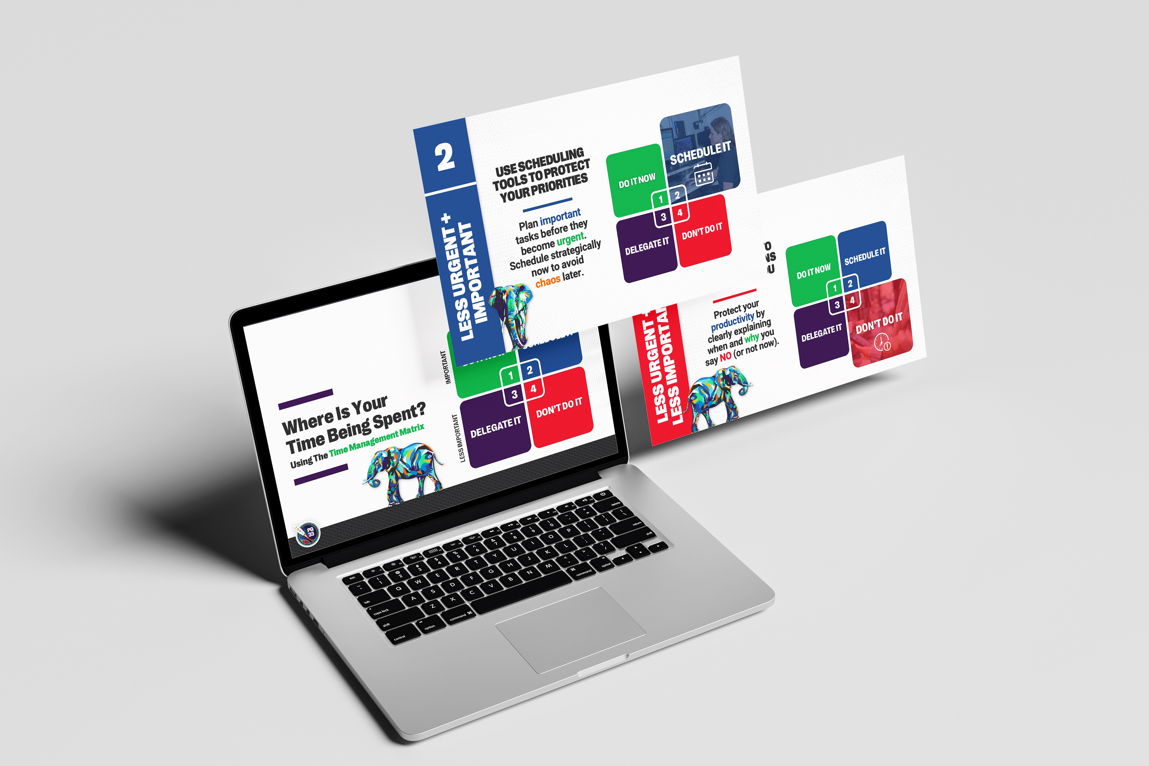
Rocket, the Elephant Who Turns “Where Do I Start?” into “What’s Next?”
Rocket is calm and focused. He approaches time management and task completion with intention, never rushing but always moving forward. First introduced in Stage 1, Rocket brings to life the familiar phrase, “How do you eat an elephant? One bite at a time.” That idea, both literal and symbolic, became a core theme in the time management content, with Rocket as its visual reminder. His character embodies the idea that even the biggest goals can be tackled by breaking them into smaller, doable steps.

Rocket was designed to reflect that mindset, using layered color, strong posture and subtle expression. As learners move through Stage 2 and 3, he continues to show up as a quiet motivator, encouraging thoughtful planning, clear decisions and purposeful action. Like leadership itself, time management is about doing the right things in the right order. Rocket helps store leaders zoom out, stay grounded in what matters and keep moving forward one step at a time.
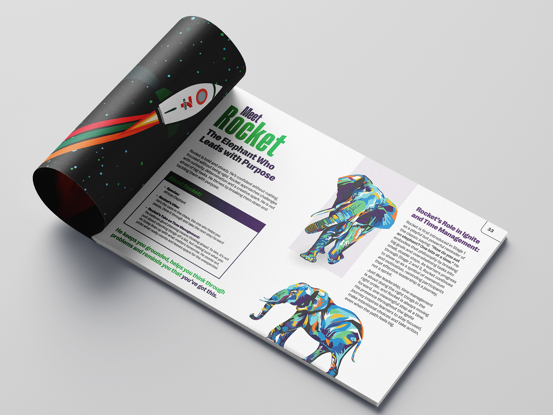
The Making of Rocket
Rocket was illustrated in Adobe Illustrator, beginning with a basic line drawing and shaped through layered color to give him visual weight and dimension. Each area of his form was constructed using tonal values and overlapping shapes, creating a bold, expressive look without relying on shading effects or gradients. To bring Rocket to life in different moments throughout the program, we used the Puppet Warp Tool to adjust his posture and create varied poses. The final illustrations feels intentional, energetic and fully in sync with the visual language of the Ignite brand.