The Challenge: Turning Confusion into Connection
Before Ignite, the store leadership development program lacked a clear identity. It was simply three separate courses, each delivered with its own PowerPoint deck and participant guide, without a unifying system to connect them. The experience felt fragmented and generic.
We set out to change that—not just by creating visuals, but by building a brand narrative that leaders could connect with. We knew the program needed more than structure; it needed meaning. The goal was to create an emotional bridge between store leaders and their journey, making them feel understood, supported and part of something bigger. We wanted to foster a sense of community and remind them that they’re not alone in the challenges leadership brings.
By anchoring the identity in story and symbolism, we gave the program a voice and a sense of direction. The brand is now more than a system. It’s an experience that reflects the reality of growth and inspires store leaders to move forward with confidence.

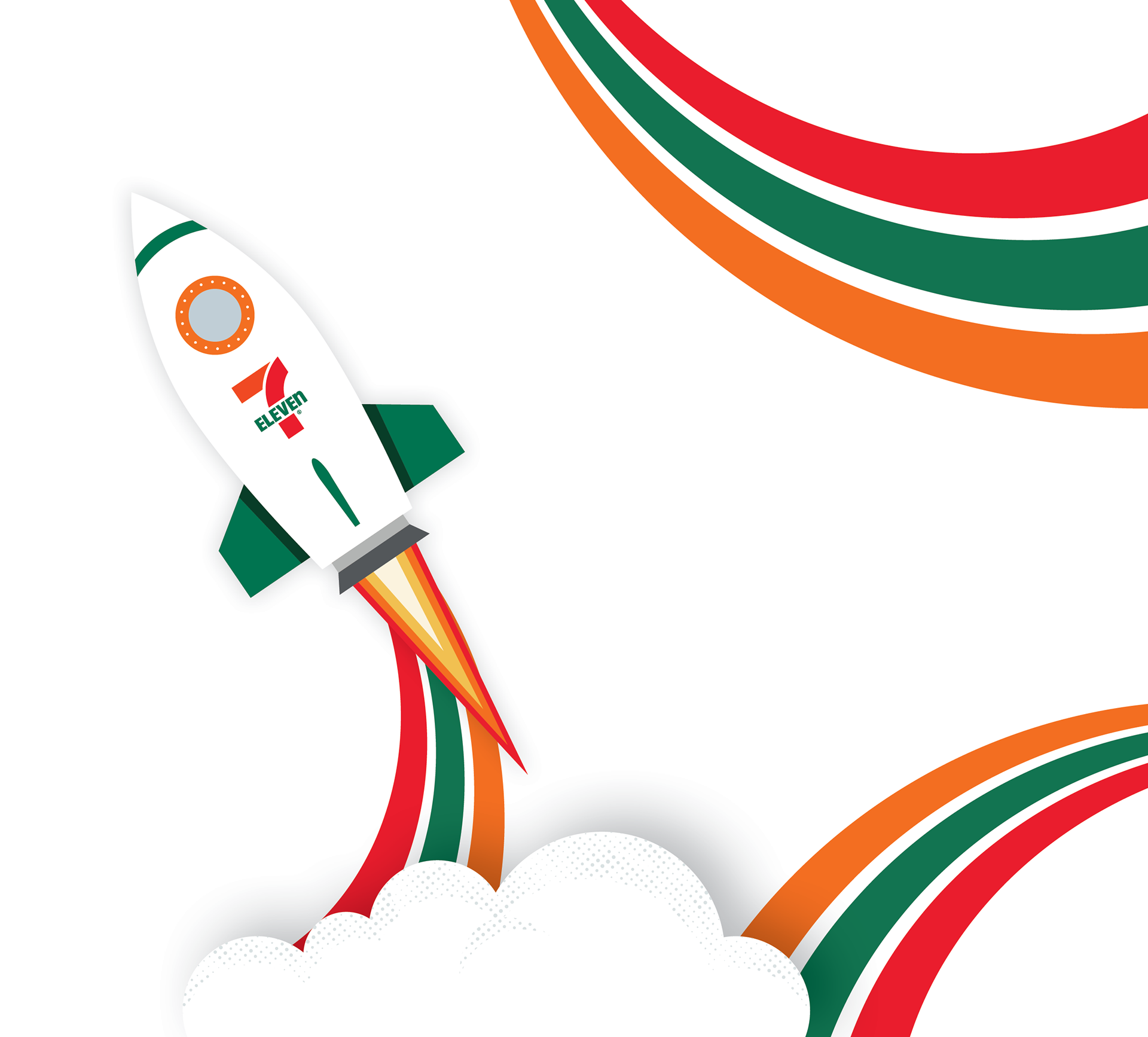
A Logo That Launches the Narrative
The Ignite logo is not just a wordmark. It’s a symbol of energy and ambition. Built on the Ghenera typeface, the logo includes custom details that tie directly to the brand. The rocket functions as both a bold identifier and a visual metaphor for the brand’s narrative. It can also stand alone as a distinct brand mark when needed. The modified “I” serves as a launch pad, reinforcing the rocket theme and the idea of taking off on their leadership journey. That same angled cut repeats in the “E,” creating balance and a sense of precision throughout the mark. The bold orange speaks to energetic, decisive leadership, while the grounded green tagline introduces a layer of growth and purpose. Set in Right Grotesk Compact, the tagline adds contrast with its clean, modern feel.
Every detail serves a purpose. The sharp geometry and strong verticals convey drive and clarity. The compact structure suggests stability and control, while the upward-leaning elements hint at acceleration and the future potential of store leaders. Altogether, the logo captures the essence of Ignite: a brand built to spark the leader within and propel them forward.
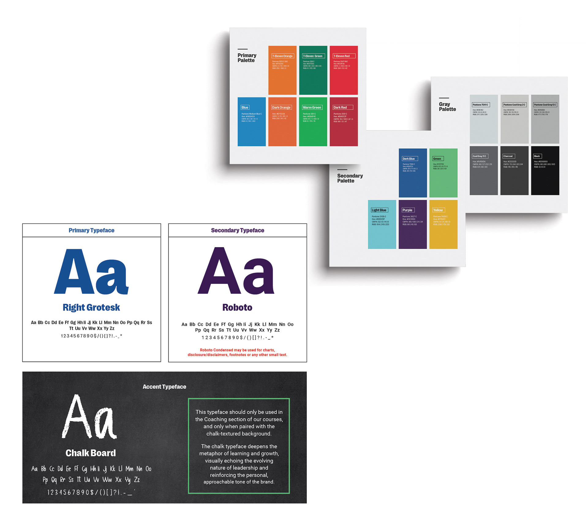
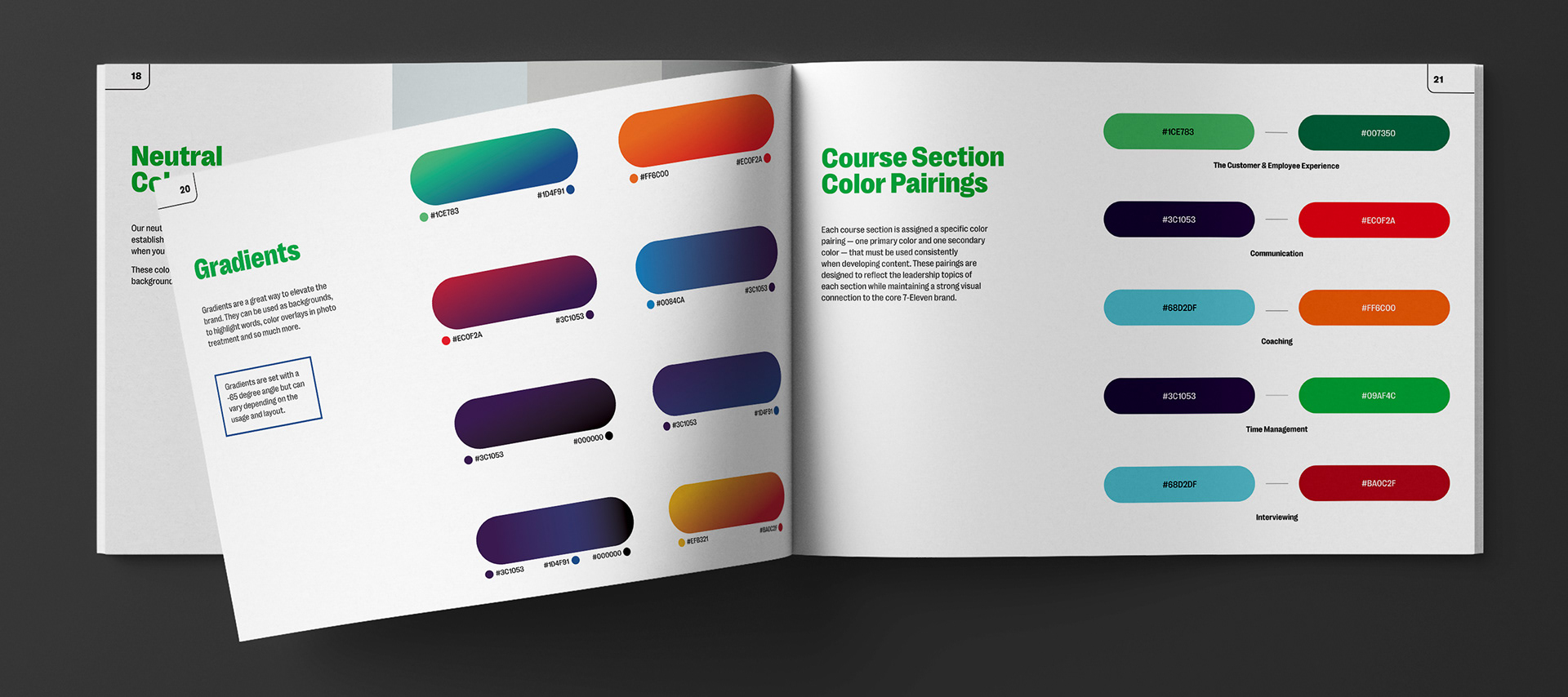
Color System: Familiar Roots, Fresh Energy
Ignite’s color palette is built in three tiers, each playing a unique role in expressing the brand.
The primary palette pulls directly from the 7-Eleven brand, creating an immediate visual link to our larger identity. It grounds the system in something trusted and familiar.
The secondary palette introduces bold, energetic tones that reflect Ignite’s personality and leadership mindset. These colors act as highlights and moments of emphasis, serving as sparks of energy that bring freshness and consistency across touchpoints. They help create a strong, trustworthy connection with store leaders while representing the diverse leadership styles they bring to their teams.
The tertiary gray palette adds balance and flexibility. These neutrals are ideal for backgrounds, charts and other supporting elements where color should step back, not stand out.
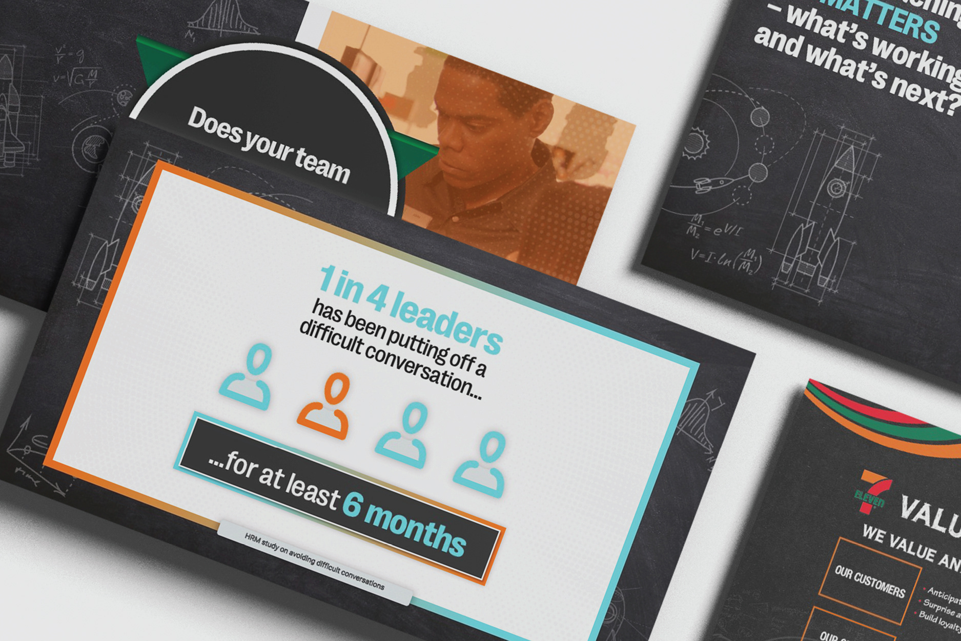
Color in Action: Defining the Learning Experience
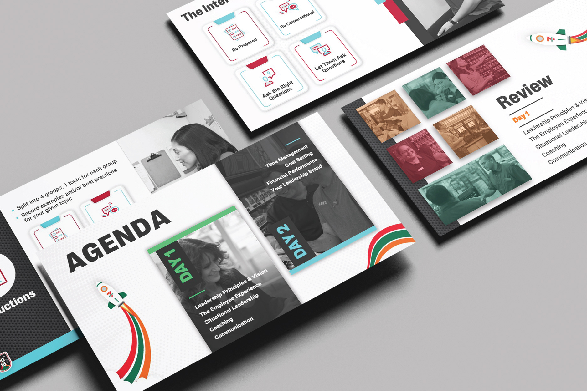
Color plays a key role in how we structure and present our courses. Each course section is assigned a specific color pairing, one primary and one secondary, that must be used consistently across all materials. These pairings are carefully chosen to reflect the leadership topics of each section while reinforcing a strong visual connection to the 7-Eleven brand. The result is a system that feels organized and aligned with the larger Ignite experience.
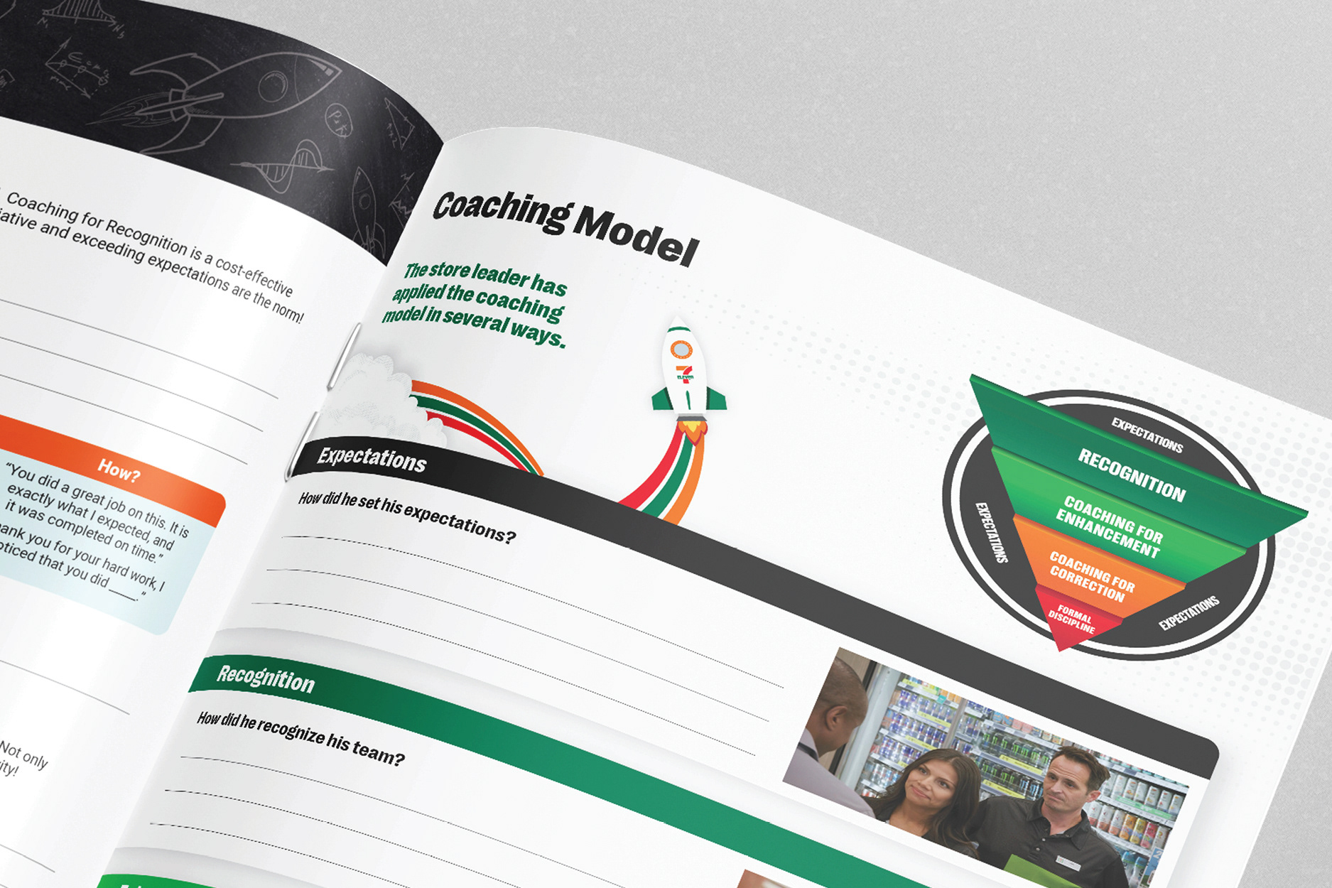
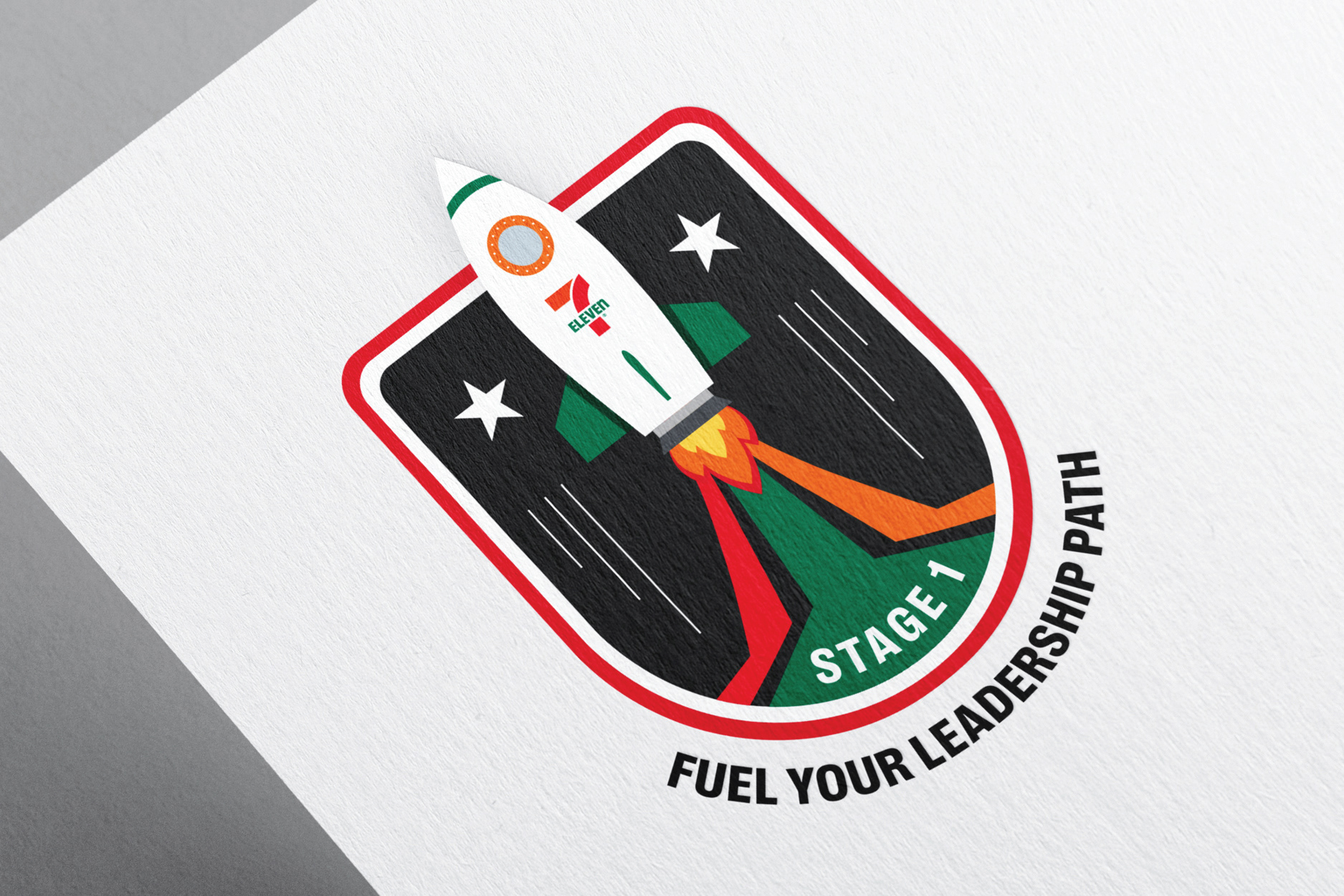
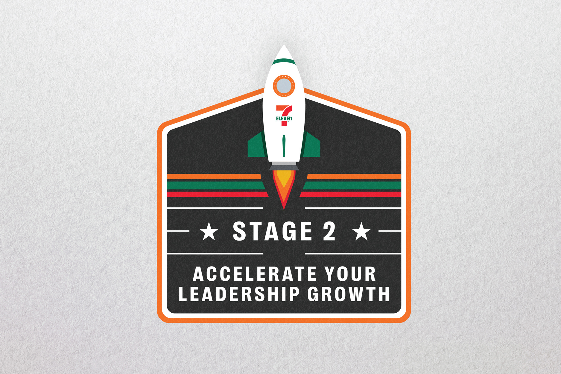
The Rocket: A Symbol of Leadership Through Motion
The rocket is one of Ignite’s most recognizable brand marks. It creates instant visual recognition and plays a central role in expressing the brand’s identity. More than a graphic element, it represents the leadership journey of our store leaders—anchoring the idea of growth, movement, and momentum.
Variations of the rocket are used to represent our broader portfolio of 7-Eleven brands. Each version is customized to reflect its brand while staying connected to the core Ignite system. These rockets help expand the storytelling potential of the identity while reinforcing the reach and flexibility of the program.
We also use flight phases to reflect the three stages of the leadership journey. Each phase is illustrated through subtle shifts in the rocket’s flame through its shape, size, and color to show progress. This layered system brings visual depth to the learning path, while keeping the storytelling grounded in motion and transformation.

Course Badges: Marking Progress With Purpose
Each course in the Ignite program is represented by a custom badge, designed to reflect a specific stage in the Store Leader’s development journey. These badges serve as visual markers of progress, guiding the learner through the experience while reinforcing a sense of growth and achievement.
Every badge features a unique tagline that ties directly to the course focus. These short phrases capture the core leadership challenge at that point in the journey, supporting a consistent narrative and adding emotional and thematic depth to the overall experience.

Stripe Patterns: A Visual Link the Journey
Our stripe patterns are visual representations of the leadership journey, connecting our store leaders to the successes and hardships they experience along the way.
Texture: Adding Depth to the Ignite Experience
Texture plays a vital role in shaping Ignite’s personality, mood and emotional tone. It serves as a powerful design tool that adds meaning and connection at every touchpoint.
Adds Depth and Dimension
Textural elements bring visual richness to the brand, preventing it from feeling flat or overly digital. By layering in subtle material effects, we create a tactile quality that brings the identity to life across both print and digital spaces.
Textural elements bring visual richness to the brand, preventing it from feeling flat or overly digital. By layering in subtle material effects, we create a tactile quality that brings the identity to life across both print and digital spaces.
Reinforces Brand Personality
The metal texture reflects core traits of strong leadership: durability, strength, and resilience. Its raw, unfinished surface symbolizes growth in progress, the ongoing journey to lead, improve and rise. These qualities connect back to the rocket imagery at the heart of Ignite, reinforcing a sense of motion and ambition.
The metal texture reflects core traits of strong leadership: durability, strength, and resilience. Its raw, unfinished surface symbolizes growth in progress, the ongoing journey to lead, improve and rise. These qualities connect back to the rocket imagery at the heart of Ignite, reinforcing a sense of motion and ambition.
Creates Visual Consistency Across Materials
Using texture consistently across course materials helps unify the system, creating a cohesive brand experience across all formats.
Using texture consistently across course materials helps unify the system, creating a cohesive brand experience across all formats.
Supports Storytelling Through Metaphor
Our textures support a core idea: leadership isn’t static. It’s forged through experience, shaped by challenges and driven by momentum. Like metal under pressure, strong leaders emerge through movement, resilience and intent.
Our textures support a core idea: leadership isn’t static. It’s forged through experience, shaped by challenges and driven by momentum. Like metal under pressure, strong leaders emerge through movement, resilience and intent.